15 Best Font for Menu Design in Restaurants


When it comes to dining out, first impressions matter — and that impression doesn’t just come from the food. Your menu design sets the tone for the entire dining experience. One overlooked but powerful element in design is the choice of font. The right typeface does more than make words legible; it conveys your restaurant’s personality, attracts attention, and influences how customers perceive your brand.

best font for menu

Choosing the right fonts can reduce printing costs by up to 77%, showing how picking the right font can save money and affect branding.

So, what’s the best font for menu design? The truth is, it depends on the vibe of your restaurant. A playful burger joint won’t use the same typography as a luxury fine dining spot. In this article, we’ll explore 15 versatile fonts across different restaurant styles, helping you find the right fit for your concept.

Why Font Choice Matters in Restaurant Menus

Before diving into examples, let’s consider why typography is so important in hospitality:

  • Guest perception: Fonts communicate mood — elegant serifs whisper sophistication, while chunky hand-drawn fonts shout fun and casual.
  • Readability: No matter how stylish, a menu font should be easy to read across different lighting conditions.
  • Brand alignment: Your menu design should mirror your restaurant’s core identity, from a family café to an upscale steakhouse.
  • Revenue impact: Believe it or not, a well-chosen font can highlight dishes, encourage upselling, and make your menu more visually appealing.

In short, choosing the best font for menu design isn’t just aesthetic — it’s strategic.

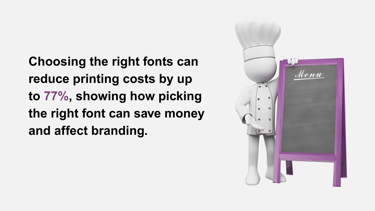
Best Fonts for Menu Design


1. Café Brasil – Coffee Culture in Typography

Inspired by the organic shape of a coffee bean, Café Brasil is perfect for cafés and coffee shops. The curves and ligatures resemble steam rising from a cup, creating an inviting, cozy feel. This makes it an excellent choice for menu boards or chalkboard-style displays.

2. Saveur Sans – Casual Meets Sophisticated

Taking cues from French Art Deco cafés, Saveur Sans is a clean yet stylish sans serif. It works beautifully for venues that blend relaxed dining with elegance — think bistros or wine cafés. If your brand is about chic simplicity, this font is a strong contender for the best font for menu titles and headings.

3. Road Race – For Vintage Coffee Lovers

Road Race carries a handcrafted, vintage appeal that resonates with slow-drip coffee bars or specialty cafés. Its serif details encourage a “sit down and savor” vibe. If your venue celebrates craftsmanship, this typeface adds authenticity to your brand.

4. French Fries – Fun and Family-Friendly

Running a family-friendly burger or pizza joint? French Fries is quirky, bold, and doodle-inspired. This playful typeface grabs attention while staying approachable, making it perfect for kids’ menus or fast-food boards where fun is part of the experience.

5. Boldline – Strong and Urban

For diners, burger spots, or soul-food joints, Boldline is all about energy. Its heavy strokes command attention, making it excellent for menu headings. Pairing it with a thin sans serif creates balance while keeping the design readable.

6. Benji – Stackable, Bold Character

Built with blocky, handcrafted strokes, Benji has a unique square structure that literally “stacks” well, much like hamburgers. This makes it ideal for fast-food concepts that want personality and boldness in their menu design.

7. Larosa Sans – Minimalist Elegance

When subtlety is key, Larosa Sans shines. Its clean lines and smooth curves make it one of the best fonts for menu design in fine dining. Use it for wine lists, tasting menus, or any format where sophistication and simplicity need to align.

8. NOIR et BLANC – Timeless Sophistication

This serif font oozes classic charm with stylish ligatures and alternating italics. Perfect for upscale dining, NOIR et BLANC looks fantastic when paired with rich backgrounds like navy, black, or burgundy. It tells guests: “This is not just dinner, this is an experience.”

9. Analogue – Modern Twist on Tradition

Analogue bridges serif and sans serif traditions, offering flexibility and modern appeal. Its light italic contrasts with bold strokes, making it perfect for contemporary fine dining or trendy wine bars.

10. Tagliatelle – Playful Italian Spirit

When thinking of fonts for Italian restaurant menus, Tagliatelle immediately comes to mind. It captures the warmth and playfulness of Italian bistros. Pair it with a clean sans serif like Open Sans to create menus that feel authentic yet approachable.

11. Pecorino – Luxury Italian Design

If Tagliatelle is playful, Pecorino is its elegant cousin. Inspired by Italian street signage, this modular typeface adds a premium touch. It pairs well with gold or white lettering on dark backdrops, perfect for fine dining trattorias.

12. Mascarpone – Italian Art Deco Flair

Another standout among fonts for Italian restaurant menus, Mascarpone brings an Art Deco edge. With its high-contrast strokes, it’s excellent for gelaterias, aperitivo bars, or any venue that wants to highlight heritage with a stylish twist.

13. Lucking Dumpling – Modern Chinese Vibe

This simple all-caps font is inspired by traditional block printing. Lucking Dumpling works best for casual Asian restaurants that want clean, modern menus while still reflecting cultural roots.

14. La Oriental – Bold and Distinct

For Chinese or pan-Asian restaurants, La Oriental makes a strong impression. Its bold strokes are highly legible, even in low light — ideal for busy dining rooms. If you’ve ever wondered “can font restaurant branding really affect perception?” fonts like this prove the answer is yes.

15. Luchador – Mexican Energy on Paper

No list would be complete without a Mexican-inspired font. Luchador packs charisma with its layered ornaments and bold shapes. Perfect for taco shops, tequila bars, or any venue that thrives on vibrant energy, this typeface almost dances off the page.

Tips for Choosing the Best Font for Menu

  • Match your vibe: Family-friendly = playful fonts. Fine dining = elegant serifs.
  • Balance readability: Decorative fonts should be used for headings, paired with simpler fonts for dish descriptions.
  • Think about materials: What works on a digital screen may not be ideal for a chalkboard or printed card.
  • Don’t overdo it: Stick to 2–3 fonts max to avoid clutter.

Let us now introduce  the Best Restaurant Management App- Call the Service.

Smarter Menus with Call The Service (CTS)

best font for menu

While choosing the best font for menu design enhances the look and feel of your restaurant, the next step is making menus more interactive and efficient. That’s where Call The Service (CTS) comes in.

CTS is an all-in-one restaurant order management app that transforms the dining experience by combining digital menus with powerful features:

  • Digital Guest Page & Customization: Create branded digital menus with real-time updates, allergen details, and promotions — all accessible via QR codes.
  • AI-Generated Images: Showcase professional, consistent dish photos instantly, without the cost of food photography.
  • Multilingual Menus: Automatically translate your menu into 100+ languages, ensuring every guest feels understood.
  • Efficiency Dashboard: Track staff performance, response times, and service bottlenecks with actionable insights.
  • Waiter Call & Guest Requests: Guests can order, call staff, or request the bill instantly from their table.

In short, pairing beautiful menu design with smart digital solutions like CTS ensures your restaurant not only looks great on paper but also delivers seamless, modern service that keeps guests coming back.

Final Thoughts

Typography is more than decoration — it’s an extension of your restaurant’s brand identity. From playful fonts like French Fries to sophisticated typefaces like NOIR et BLANC, the right choice can elevate guest experience and even influence sales.

So, when you ask yourself which is the best font for menu design, consider your restaurant type, target audience, and atmosphere. Whether you’re exploring fonts for Italian restaurant menus, designing for a quirky café, or wondering if fonts can font restaurant branding truly matter — the answer is clear: fonts set the mood before the first dish arrives.

Choose wisely, and your menu won’t just list food — it will tell your story.

Choosing the right font can make or break your restaurant’s menu. In this blog, we explore the 15 best font for menu design in restaurants—balancing readability, style, and brand personality to create a dining experience that leaves a lasting impression.

Leave a Reply

Your email address will not be published. Required fields are marked *